A HEURISTIC EVALUATION OF
SSENSE's Browsing & Check-out Experience
During my UX diploma program, I conducted a heuristic evaluation of SSENSE, a Canadian luxury e-commerce retailer specializing in designer fashion and high-end streetwear to propose suggestions for ways to improve their current shopping and check-out experience for users.
SSENSE
PROJECT OVERVIEW
Role: UX/UI Designer
Timeline: 1 week
Tools: Figma
Other team members: Eve Chen
Using Jakob Nielsen's 10 usability heuristics for design, my partner and I evaluated the current shopping & check-out experience on SSENSE to measure the extent to which current design elements are adhering to these guidelines and proposed several suggestions on how it can be improved.
WHY CONDUCT A HEURISTIC EVALUATION?
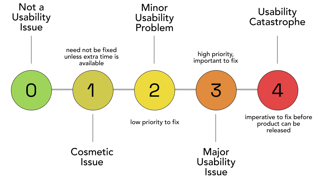
Heuristic evaluations are important for any site or app to spot any potential usability issues that might be hindering the overall experience of the product. The identified issue or 'violation' is then measured against a severity rating scale to determine how important and urgent the issue needs to be fixed so that it doesn't compromise usability.
This is the severity rating scale that we used with 1 rated as a minor usability issue and 5 rated as a usability catastrophe.
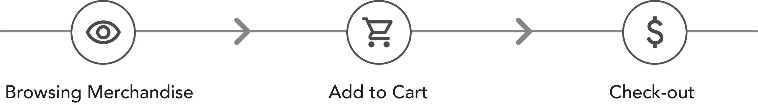
IMPROVING THE BROWSING & CHECK-OUT EXPERIENCE
For this project, we chose to focus on evaluating the shopping and check-out experience which consists of browsing through items, adding to cart and submitting payment.
THE EVALUATION
-->The Browsing Experience
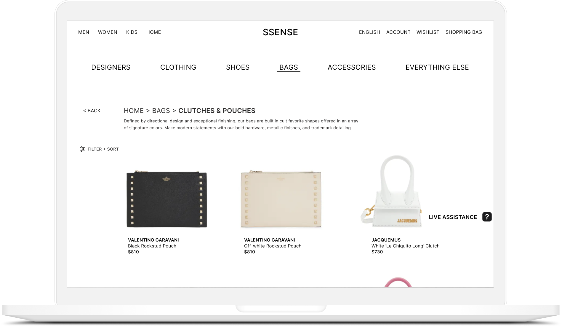
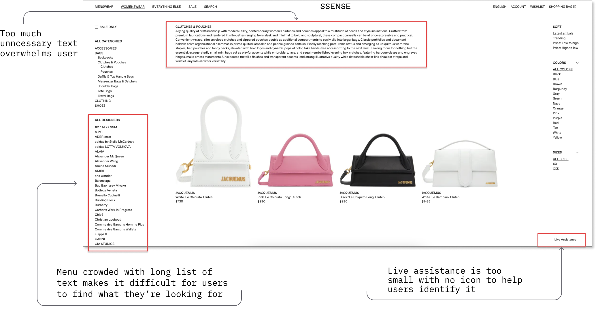
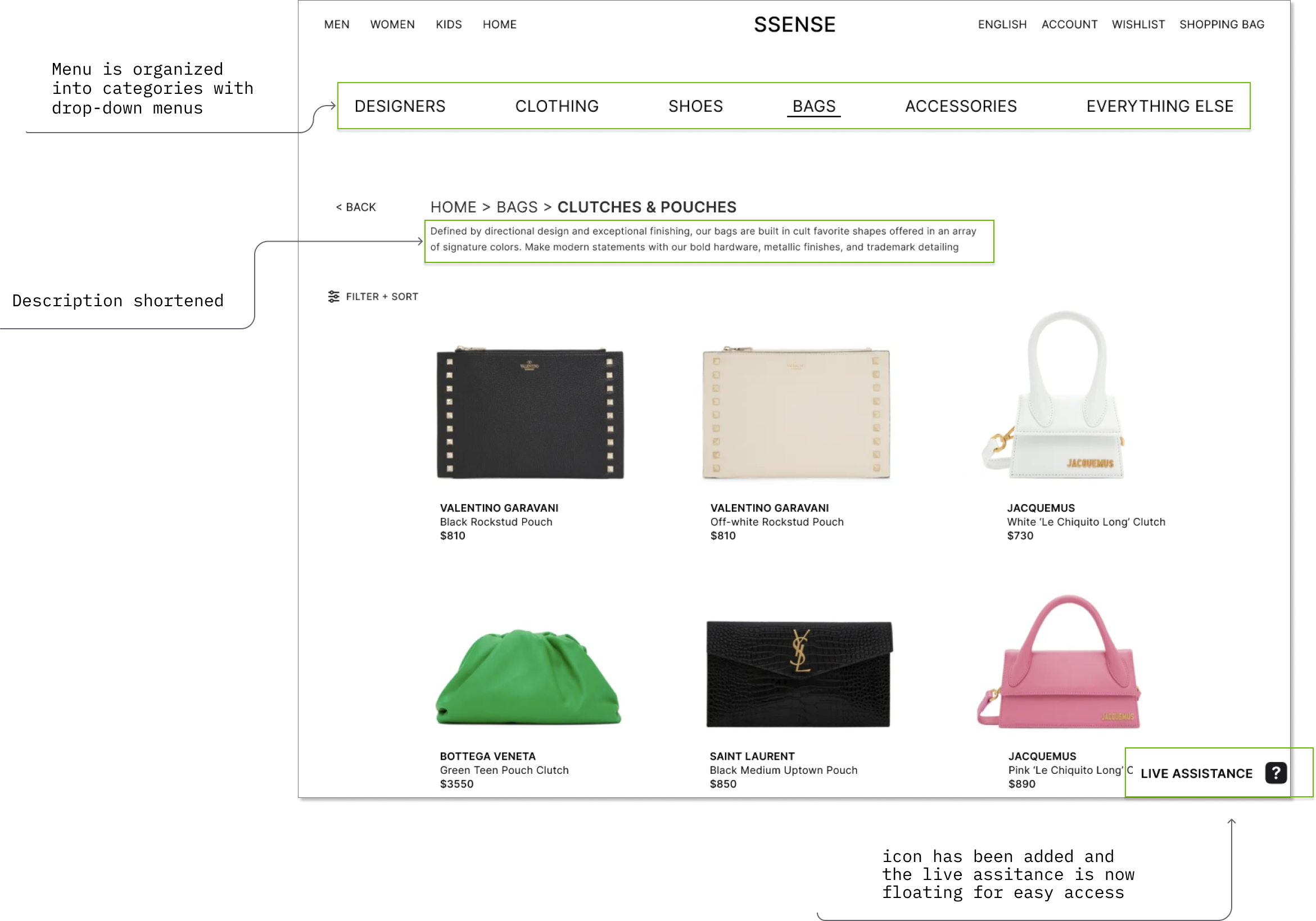
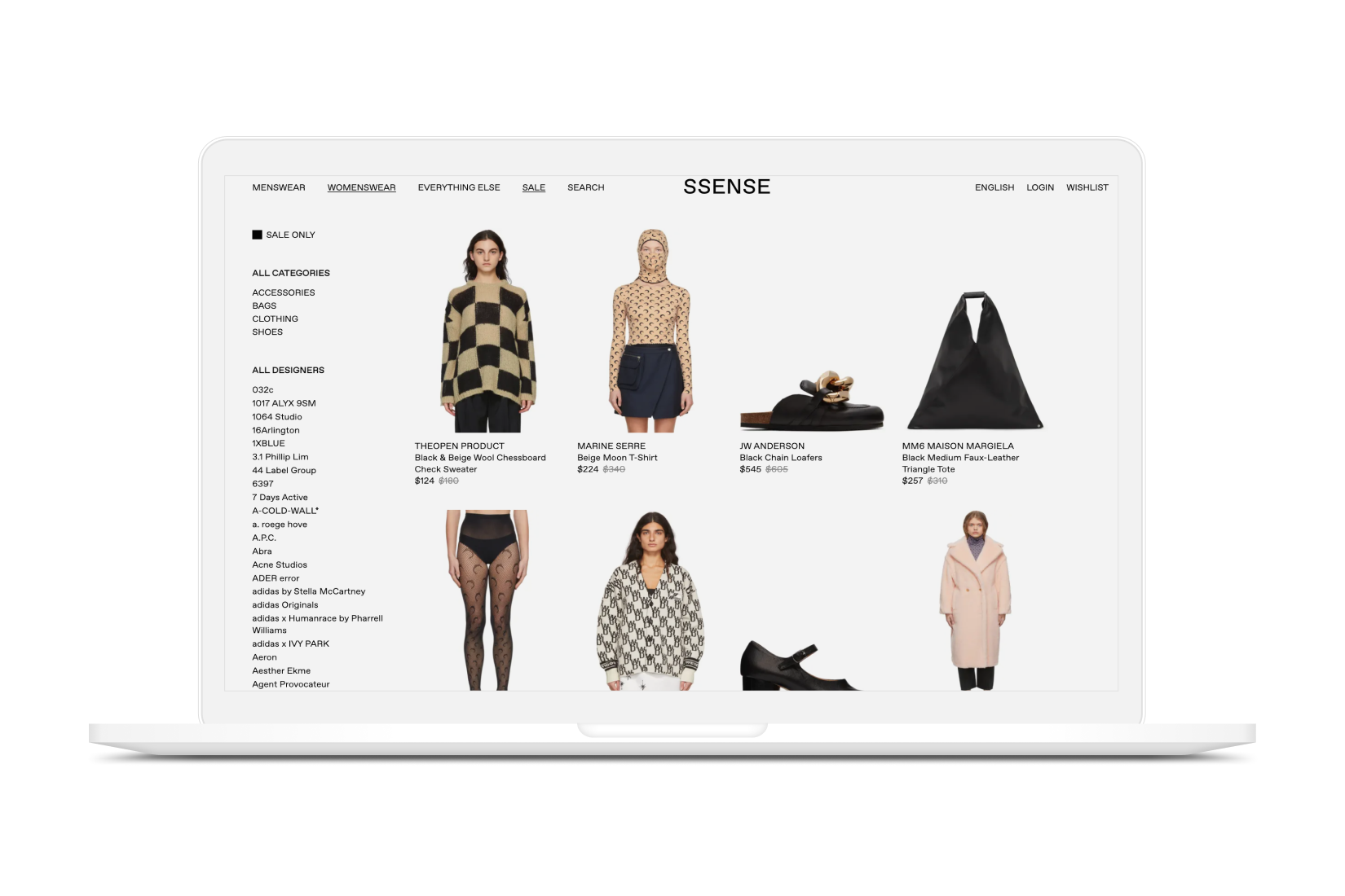
1. Crowded menus
Reason for violation: Menu is crowded with a long list of text making it difficult for users to find what they’re looking for
Suggestion to improve: Creating information hierarchy by further separating all the brands into different categories using a drop-down menu rather than listing them out would help users identify what they’re looking for more easily
Heuristic violated: Aesthetic & minimalist design
Severity rating level 2- minor usability problem
2. Too much text
Reason for violation: Certain pages have product descriptions that are too lengthy for users to read.
Suggestion to improve: Eliminating some text to include only key information can help users better process it.
Heuristic violated: Aesthetic & minimalist design
Severity rating level 2- minor usability problem
3. Live assistance feature too small
Reason for violation: The live assistance feature is too small with no icon to help users identify it.
Suggestion to improve: Adding a icon and increasing the text size will help users notice it better.
Heuristic violated: Help & Documentation
Severity rating level 2- minor usability problem
BEFORE
AFTER
--> The Product Page
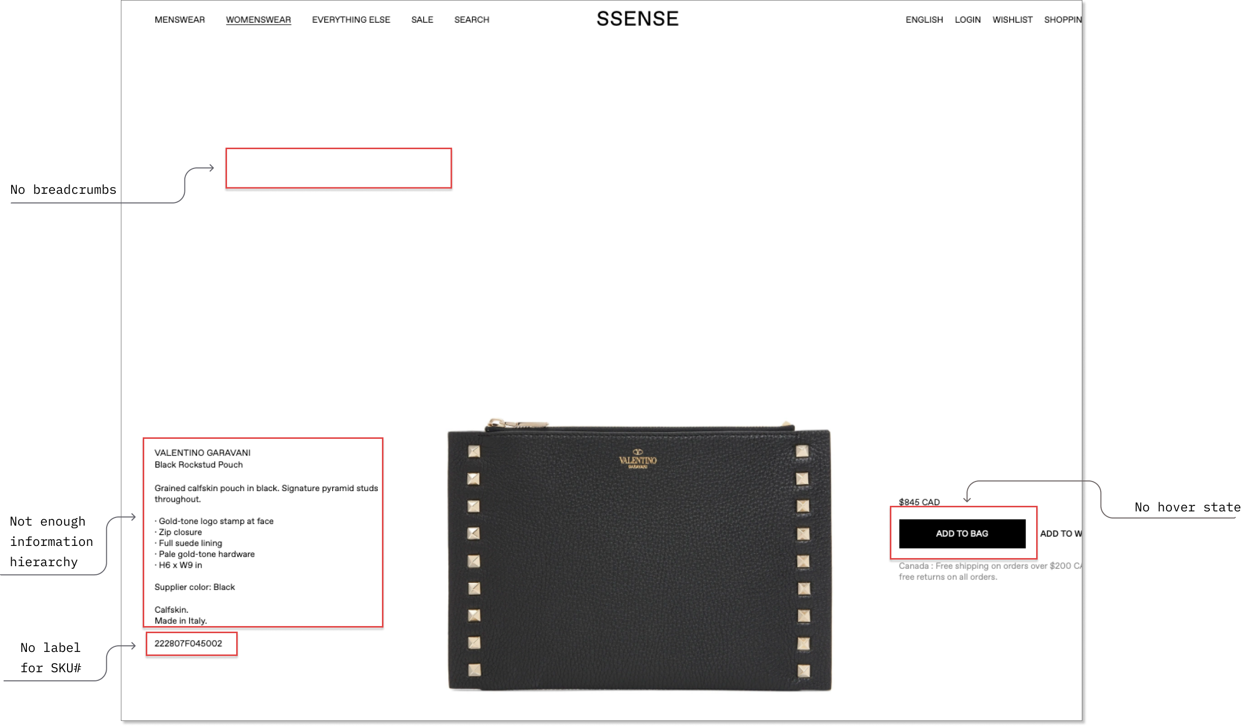
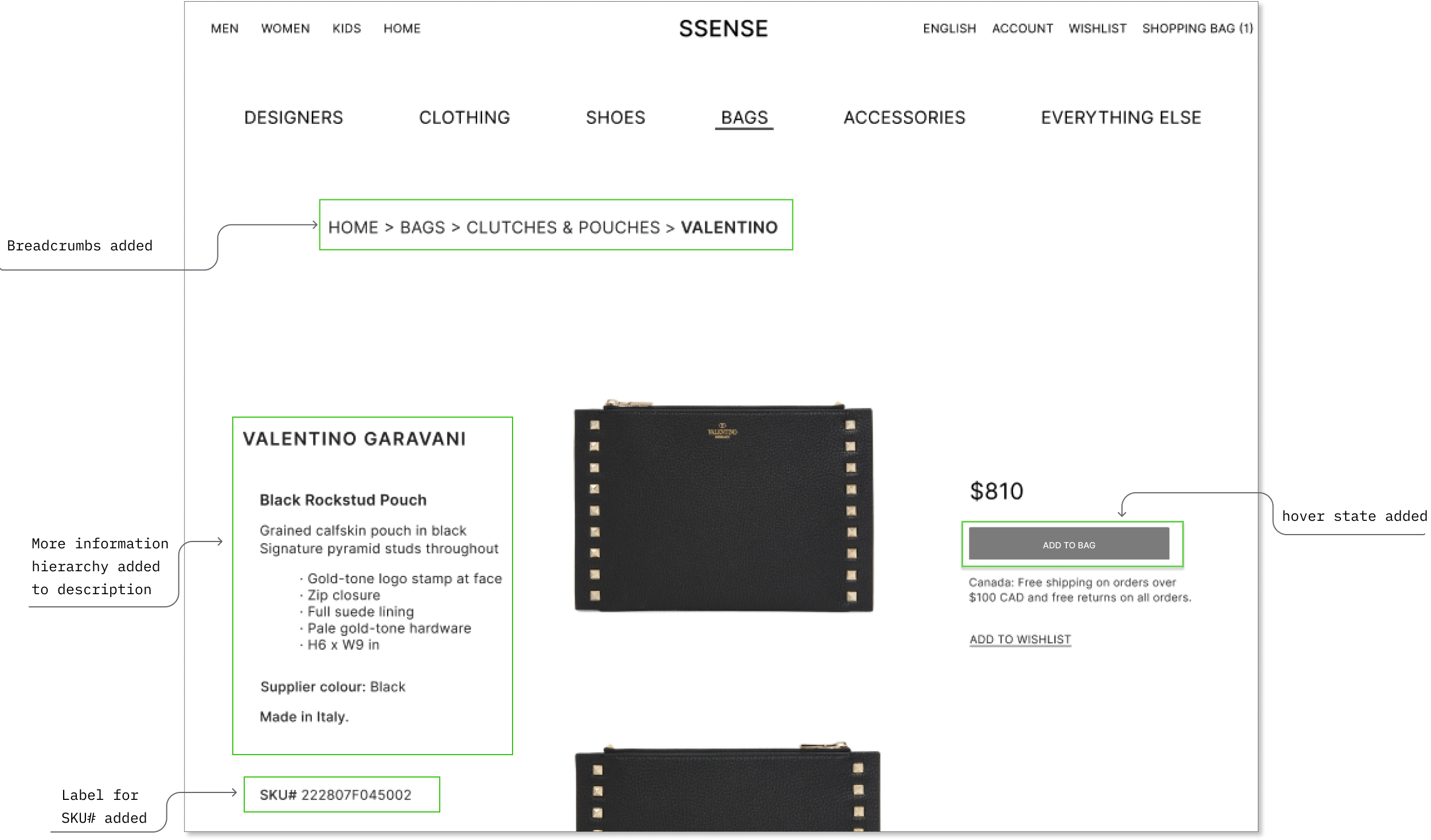
1. No hover state changes on buttons
Reason for usability violation: Across the site, buttons did not have a state change when hovered over with a cursor.
Suggestion to improve: To increase interactivity and accessibility, creating a state change eg. changing the button color when hovered over will help indicate to users that the button is active and ready to be clicked on.
Heuristic violated: Visibility of System Status
Severity rating level 2- minor usability problem
2. No breadcrumbs
Reason for usability violation: There are no breadcrumbs on pages to help users keep track of where they currently are on the site.
Suggestion to improve: Adding in breadcrumbs on pages will help users remember which pages they've visited which is especially important if the site has a lot of items or products.
Heuristic violated: Visibility of System Status
Severity rating level 2- minor usability problem
3. Product description is too crowded
Reason for usability violation: The product description text is quite small which can be difficult for users to see. In addition, there is minimal information hierarchy to help users distinguish the different levels of information.
Suggestion to improve: Increaseing text size and using different weights eg. bolding the product name and designer name can significantly help with readability. Adding in more white space between the various levels of info can also help users scan it more quickly.
Heuristic violated: Visibility of System Status
Severity rating level 2- Aesthetic & minimalist design
4. Missing SKU# Label
Reason for usability violation: SKU numbers (product code) have no labelling to help users reference product
Suggestion to improve: Adding a label would help users understand this is the SKU number and mitigate any confusion
Heuristic violated: Match between the system and real world
Severity rating level 2- minor usability problem
BEFORE
AFTER
--> Adding to Cart
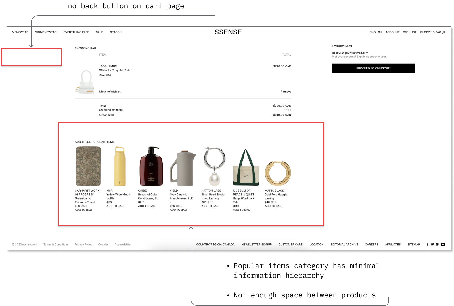
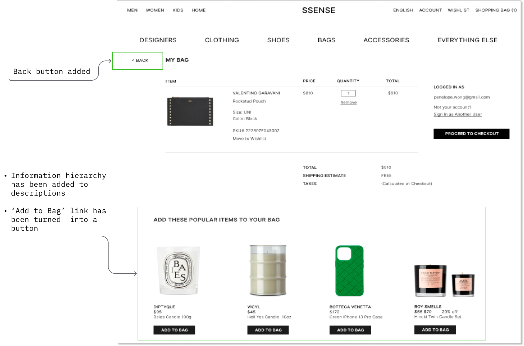
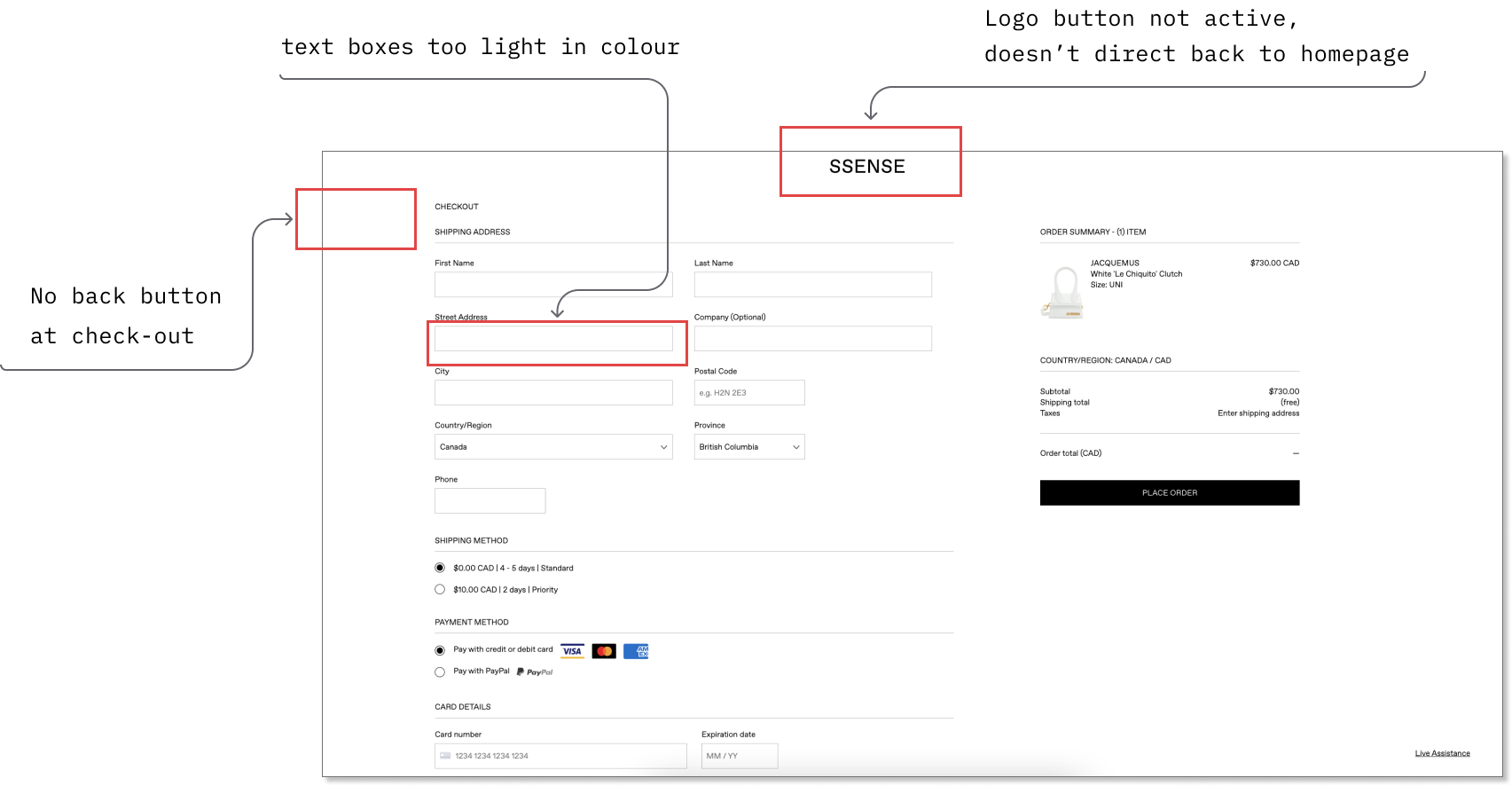
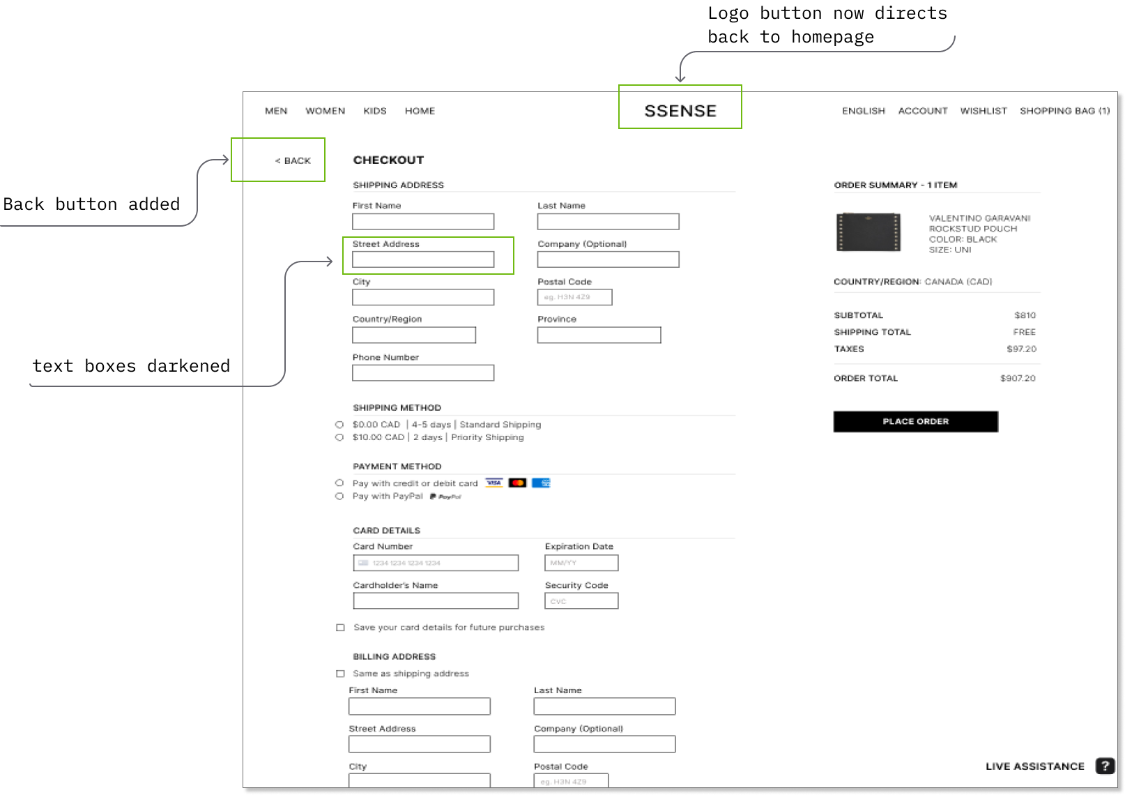
1. No back button
Reason for usability violation: There is no back button at check-out for users to exit out of the page
Suggestion to improve: Adding a back button to give users a clear exit to leave the page will help eliminate any frustrations with wanting to exit the current task.
Heuristic violated: User control & freedom
Severity rating level 3- major usability problem
2. Crowded popular items section
Reason for usability violation: The recommended popular items category is crowded together with not enough information hierarchy making it difficult for users to scan the information.
Suggestion to improve: Spacing out the items and adding more information hierarch like bolding out product names and creating actual buttons for users to 'add to cart' can help them stand out more.
Heuristic violated: Aesthetic & minimalist design
Severity rating level 2- minor usability problem
BEFORE
AFTER
--> Checking Out
1. Broken button
Reason for usability violation: The logo ‘SSENSE’ at checkout does not lead users back to the home page when clicked.
Suggestion to improve: Changing the logo into an active button that directs users back to the home page will improve usability as this is a consistent functionality across websites that users are familiar with.
Heuristic violated: Consistency & standards
Severity rating level 4- usability catastrophe
2. No back button
Reason for usability violation: The logo ‘SSENSE’ at checkout does not lead users back to the home page when clicked, especially when there is no back button
Suggestion to improve: Changing the logo into an active button directing users back to the home page would improve usability as this is a consistent functionality across websites
Heuristic violated: User control & freedom
Severity rating level 4- major usability issue
BEFORE
AFTER
NEXT STEPS
For our next steps, we plan to conduct several rounds of user testing to receive feedback from users and ensure that our redesigns are usable with no issues. Once that is done, the next course of action will be to hand the redesigns off to the development team to implement our proposed changes.
KEY LEARNINGS
1. Driving business goals while ensuring usability. During my evaluation, I pointed out several violations including a missing back button and broken SSENSE logo button at check-out. While these may be violations according to the Heuristics as they may hinder usability, it may not necessarily be a bad thing as these decisions may actually be beneficial to help boost sales from a business perspective. However, as a UX designer, it's important that we conduct evaluations to point out any potential issues and generate discussions to ensure that the final designs will be in the best interest of both the user and the business.
2. Balancing accessibility needs and a brand's unique identity. SSENSE's designs are very unique and simplistic which suits its brand identity well. However, in a world where UX is necessary to ensure that everyone is able to use services online despite any accessibility needs they might have, designs that are too simplistic may not always be usable to those individuals. From this evaluation, I learned the importance of striking a good balance between maintaining the integrity of a brand's style identity and making the site more accessible to all users by making small changes such as incorporating more labels, adding icons and increasing text size.
3. There is always room for improvement. No matter how good a design is, it never hurts to conduct an evaluation and receive a new perspective from a fresh pair of eyes to see if there are any changes or improvements that can be made to make the designs even better.
For work inquiries or to chat with me, please do email me at becky.liang@gmail.com
Thanks for reading! 
Interested in seeing more from me?
SSENSE Heuristic EvaluationProject type
TrustKey Mobile AppA reviews-based mobile app designed to increase transparency and accountability between tenants and landlords within Vancouver's housing rental market